
Do you believe that usability is something not worth thinking of? Do you suppose that attractive web design is the only thing one should care about? So, you are absolutely wrong!
Usability is a very important factor of every website. If your website is amazingly beautiful, but difficult to use, it won’t be popular. That’s why today we are going to offer you a list of useful usability tips any web master should know.
1. Home page and Tagline mean a lot!
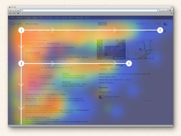
Do you know that some recent researches show that only 23% of visitors scroll when they visit some site for the first time. So, 77% of visitors do not scroll at all and just look through the content located above the fold. Of course, this doesn’t mean you should try cramming all your content in the upper area of your index page, this means you should organize your content properly.
First of all, do you know what tagline is? A tagline is a kind of website motto that can represent your personal or company main aims, philosophy etc. Your web site tagline should be the most obvious element on your home page so your visitor can understand easily and quickly whether he or she opens a proper site.
Some basic tips:
• The best place for your company logo is the upper-left part of the screen.
• Your tagline should answer one simple question “What do you do?”
2. Let them find what they want!
Search box is another important element any web site should have! It offers your visitors an easy and quick manner to find anything they need.
The best place for a search box field is the top of your web page, as users tend to scan websites according to the well-known F pattern (from the top left to the bottom right).
Some additional things to take into account:
• Jacob Nielsen’s research shows that it’s better to use 27-characters wide search boxes than 18-characters ones.
• Add a search button and clearly specify its search text, try avoiding texts like Go or Submit, because they usually mislead your visitors.
3. Navigation is a key to success!
When it comes to navigation, there are two basic principles: it should be intuitive and simple.
• Experienced web masters put it at the top of every website page and limit the number of options if they don’t want to overwhelm their visitors with a huge number of choices.
• Don’t use long texts: a short “About” is better than “Our Company Information”.
• Don’t forget to link your company’s logo with your home page!
4. Content Organization
Any user is looking for a content that is easy to read and to understand and that is organized in a pleasant way.
How can you make any content readable?
• Choose proper text and background colors! Even if some text-background color combinations may look stylish, think twice before using them. As nobody will be eager to ruin eyesight reading your articles!
• White spaces and appropriate font sizes can improve comprehension.
• People don’t like reading! That why your posts should be short and easy-to-understand. Forget about long sentences and paragraphs and remove any unnecessary details.
• If you do publish a long article, use simple and concise headings.
• Try breaking up all long paragraphs into bulleted lists.
• Don’t forget about text formatting! Highlight the most important pieces of information in bold and italics.
• User-friendly hyperlinks are also important. Let your users know what they will see once they click the link. And make the links they have visited change their color.
• Sometimes photos, graphs, charts can replace hundreds of words! But mind: abusive use of images and graphics is always bad for a website.
• Avoid any content that looks like an advertisement as most users are blind to ad banners. And they’ll skip anything that looks like ad!
5. UI Controls
User interface control is any element of your web page, component or widget that a user can interact with (for example, a button, a drop-down list). So, when using text formatting or adding some graphics to your website, mind the following things:
• Don’t design elements the look like buttons, but are not buttons in fact!
• Don’t underline text to make it look like a link, if you are not going to make it clickable!
• Make sure that your interface controls are consistent.
6. Some words about Javascript
Of course Javascript techniques are very helpful if you need to create a responsive website, but you should always remember that almost any new technique means browser inconsistency. Not all your users update their browsers regularly. Sometimes they even don’t have Javascript enabled by default.
7. Speed up your site
Modern users are very impatient: they hate waiting! Just check your website loading time regularly! If it takes too long to load your pages, you should think about optimizing it as soon as possible.
Remember about “two second rule”: an average visitor doesn’t want to wait more than 2 seconds for a site to load.
8. CAPTCHAs and Registration
As you may know, the most common form of CAPTCHA is a kind of text embedded in an image used to differentiate real users from spam bots.
The main problem with CAPTCHA is that it causes complex processes in users’ brains (figuring out the text, adding numbers etc.). Nobody wants to spend time this way! Forget about too many CAPTCHAs if you do want to get regular visitors!
Another common mistake most of web masters commit is registration demand. If you do need your visitors to register, ask for the minimum of information, as long registration forms will cost you many of your visitors.
9. Contact Information
Some web masters believe that a traditional “About Us” page looks too boring. Still, confidence is something you can’t forget about, and people need an easy way to learn more about you. So it’s up to you what form to use, but if you care about your visitors, you should offer them this information.
10. Test your usability regularly!
You should test your website usability regularly. Try to look at it as if you were an average user. Don’t wait until the moment when it’s too late to change something.
Diane Parks is a usable web design fan who tries to express her thoughts in a simple and friendly manner so that everyone can understand easily.